The Eye of Colour
Life can certainly be enriched by the well crafted spoken word. Examples which spring to mind include the treasure trove of the world’s great writers and poets. Different cognitive pathways, however, interpret the spoken and written word and where a well spoken dialogue will perhaps have a greater resonance than one’s own reading of the same text. Patterns in text based on the use of individual letters may, however, go unnoticed. It was this notion that encouraged me to check for patterns in text by assigning colours to specific letters. An obvious choice of text was, of course, the works of Shakespeare.
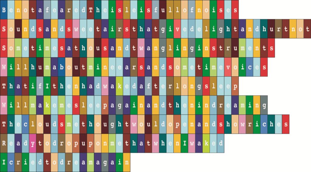
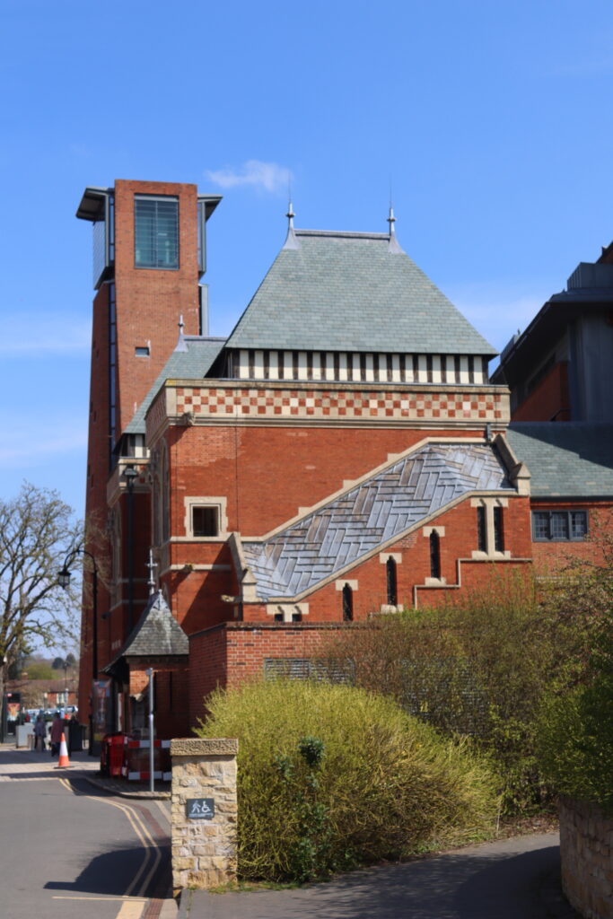
A first attempt was to print a linear design like a bar code to depict the opening text in Richard III. – ‘Nowisthewinterofourdiscontectmadeglorioussummer’ – by removing spaces. A next attempt was to use coloured rectangles with the letter printed is white. This requires therefore 26 distinguishable colours for the depiction of lowercase letters of the alphabet and assuming digits 0 to 9 are not required. The challenge then is to choose the specific colours for the display. Living at that time close to Stratford upon Avon, the colour space was in fact produced by selection from images taken by myself within the famous town. Use was made of the design package Adobe ‘Illustrator’ which includes a feature to capture and copy colours within a specific image. A colour ‘palette’ could therefore be created from a specific image that would be in some ways unique.
Various selections of passages of Shakespeare text were selected for representation within this colour space as shown in the various attached illustrations. A set of this work was completed in 2012 – co-incident with the London Olympiad. The collection then was described as the ‘Stratford Collection’ though I was never successful at that time of attracting the interest of a gallery to promote such work.
One of the challenges of producing art based on this theme is to choose an appropriate medium. A screen print would carry some element of an individual creation – but would probably be too complex to create – too many colours. A giclee print might be too ‘superficial’. Photographic print – perhaps as a limited edition on a trendy metal – and covered in acrylic resin for good measure would be another option. A fabric print could make the grade since it could hang like a tapestry and the print resolution would be acceptable with the right fabric. Also, fabric printing is now offered on a wide range of fabrics and at reasonable cost. Before lockdown I did suggest an exhibition of such formats in the Royal Shakespeare Theatre in the Paccar Room on the first floor.
An Example